Make Your Website More Than Just a "Virtual Shop Window": 10 Sincere Ways to Multiply Your Conversion Rate
Imagine walking along the famous Kordon promenade in Izmir. Dozens of establishments are lined up side by side. They are all sparkling, all inviting. But which one would you sit down at? The one that greets you most warmly at the door, the one with the clearest menu, or the one that is most crowded (i.e., feels trustworthy) inside?
The situation is exactly the same in the digital world.
Your website, as we at Ovarsa Software Technologies always emphasize, is your 24/7 branch. However, if visitors (i.e., traffic) leave without making a purchase, getting a quote, or clicking the "contact us" button, it's like a customer entering a store and "just looking and leaving." In digital marketing, we call this the "Conversion Rate."
If your visitors are wandering around your site like "ghosts," it means there's a bottleneck somewhere. Let's look at 10 "real" ways to break down this bottleneck and turn your visitors into loyal customers, not from a programmer's perspective, but from a human's.
1. Speed is a Necessity, Not a Luxury (We Have No Patience!)
Let's be honest, we're all in a hurry on the internet. When a page takes longer than 3 seconds to load, the probability of closing that tab increases by over 50%. Traffic in Izmir can sometimes be congested, but your website should never "stop and go." Optimize your visuals, get rid of unnecessary code. A fast site is the digital way of saying to the customer, "We respect your time."
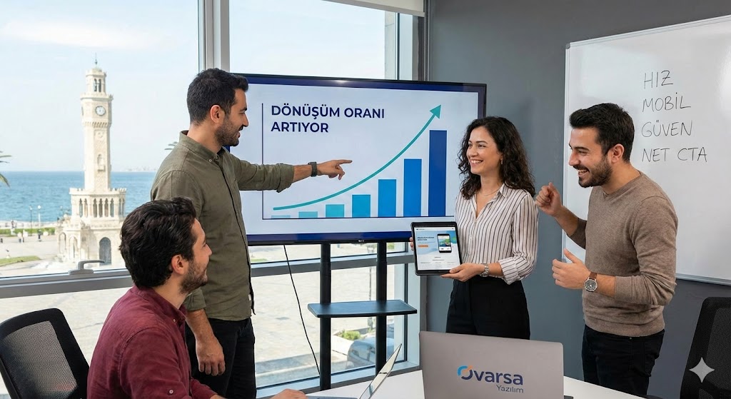
2. Don't Make Them Ask, "Where Do I Click?" (Clear CTAs)
Don't lead the user into a labyrinth. The person entering your site should understand "instantly" what you want them to do. "Get a Quote Now," "Try for Free," and "Contact Us" buttons (Call to Action - CTA) should be prominently displayed on the page, in a contrasting color and with clear language. Don't be shy; show the way to the customer.
3. Mobile Compatibility: Don't Just Say "It Exists"
Now everyone's world is in their hands. Your site may look great on a desktop, but if the buttons are overlapping and the text is tiny on a mobile phone, you've lost that customer. Your potential customer, sitting on a ferry, bus, or in a cafe in Izmir, should have a "smooth as butter" experience when they access your site from their phone.
4. Don't Make Filling Out Forms a Torture
Nobody likes filling out long forms. If just name, surname, and phone number are enough, why treat it like "your mother's maiden name"? Keep form fields to a minimum. Every extra box you add is a barrier that lowers your conversion rate. Simplicity always pays off.
5. Build Trust (The Power of References)
Just as we check Google reviews before entering a restaurant, your clients will also check "What are others saying?" before working with you. Make the logos, customer reviews, or success stories of companies you've worked with visible. Just as our references in Izmir empower us at Ovarsa Software, your references will be a digital "guarantee" for you.
6. Don't Let Your Images Shout "Stock Photos"
People in suits shaking hands, overly happy and artificial... Everyone recognizes these photos now, and nobody believes them. If possible, use real photos of your own products, your own office, your own team. Realism brings sincerity; sincerity brings sales.
7. Use the "Don't Miss Out" Psychology (FOMO)
Human psychology is strange; it desires what is elusive, not what is attainable. Phrases like "Last 3 Items," "Sale Ends at Midnight," or "Limited Availability" speed up the decision-making process. But be careful: Be honest and don't lose your credibility.
8. Live Support or Chatbot: Say "I'm Here"
When a customer has a question, they don't want to send an email and wait 24 hours. A friendly "How can I help you?" box appearing in the bottom right corner of your site significantly increases conversion rates. Whether it's an AI-powered bot or a real employee, that immediate communication bridge is the key to closing the sale.
9. A/B Testing: Don't Guess, Try
"Which button gets clicked more, a red one or a green one?" You can't find this out by arguing, you find it out by trying. Show half your visitors red and half green. Data doesn't lie. At Ovarsa Software, we believe that data-driven design is more important than aesthetics.
10. Make Your Value Proposition as Clear as Crystal
Someone reading your website's headline should be able to answer the question "What does this company do and how can this benefit me?" within 5 seconds. Use clear, impactful headlines that are focused on benefits, instead of flowery, literary sentences.